NexSupport — Next.js AI Customer Support SaaS Template
Production-ready Next.js 15 SaaS template for AI customer support tools. Dark mode, Tailwind v4, shadcn/ui, Motion animations, full dashboard and landing page included.
Secure checkout via Gumroad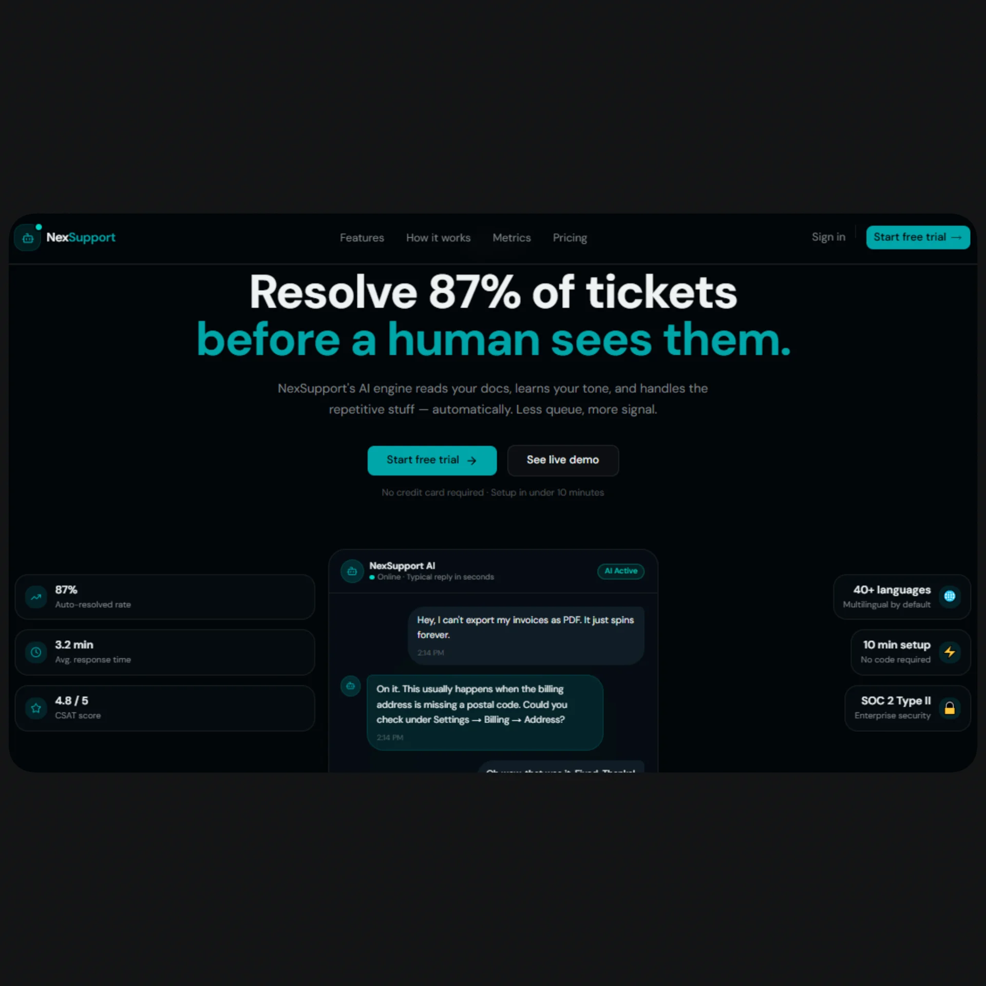
Overview
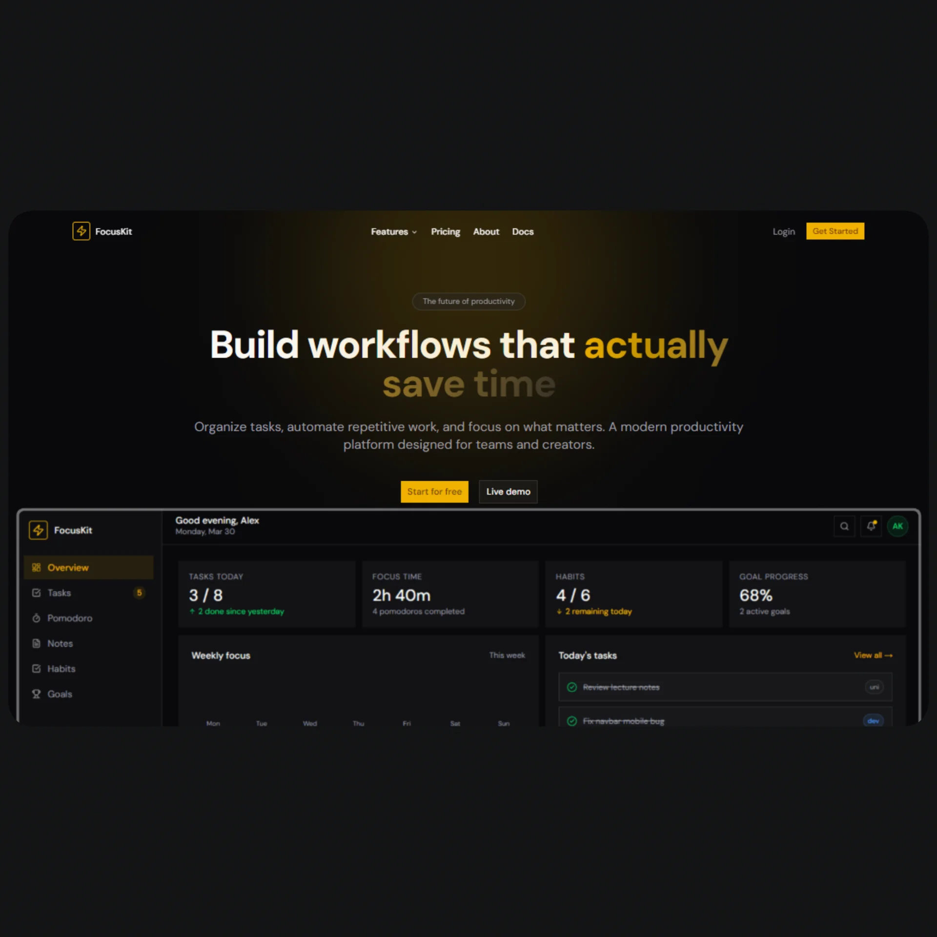
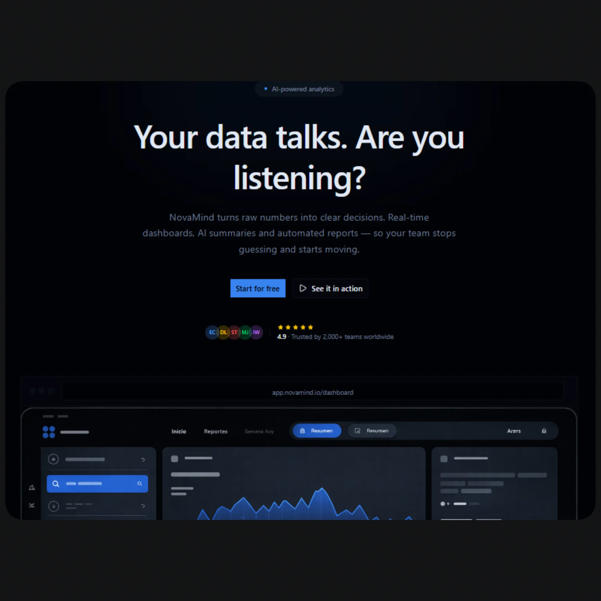
NexSupport is a full-stack Next.js SaaS UI template purpose-built for AI customer support products — think Intercom meets ChatGPT, with a real analytics layer on top. If you're building a ticket automation tool, an AI inbox assistant, a chatbot-as-a-service product, or any B2B SaaS in the support automation space, this template gives you a production-ready foundation with zero design debt. The landing page includes a live-animated chat widget hero, a feature grid, metrics counters, testimonials, FAQ, a full pricing section with monthly/annual toggle, and a conversion-focused CTA — all wired to a single config.tsx file so you can rebrand and relaunch in under an hour.
The dashboard is where NexSupport stands apart from generic SaaS starters. It ships with five fully built pages: an overview with KPI cards, area charts, and a real-time ticket table; a conversations panel with a split-view thread browser and animated chat bubbles; a ticket analytics page with stacked bar charts, a donut chart, sentiment bars, and a sortable table; a usage metrics page with token consumption trends, cost history, and intent rankings; and a visual chatbot builder with drag-and-drop flow steps powered by Framer Motion's Reorder API. Every dashboard page uses shadcn/ui components, recharts for data visualization, and Tailwind v4 CSS variables for consistent theming across all surfaces.
The entire template is dark-mode-only, using a hand-tuned oklch color system (Cyber Teal / Deep Navy) that reads as modern and trustworthy — appropriate for B2B enterprise buyers without feeling sterile. Every color token, gradient, glow, and shadow is defined as a CSS variable in globals.css and reused consistently across components. There are no hardcoded style values anywhere in the codebase. The template is fully responsive from 320px mobile to 1920px widescreen, ships with per-page generateMetadata for SEO, and is structured to slot directly into a Next.js 15 App Router project with TypeScript strict mode enabled.
Stack
| Layer | Technology | |---|---| | Framework | Next.js 15 (App Router) | | Language | TypeScript | | Styling | Tailwind CSS v4 | | Components | shadcn/ui | | Animation | Motion (motion/react) | | Charts | Recharts | | Icons | lucide-react | | Color system | oklch (dark mode only) | | Font | Geist Sans + Geist Mono |
Project Structure
├── app/
│   ├── layout.tsx                  # Root layout — import globalMetadata here
│   ├── page.tsx                    # Landing page — assemble sections here
│   ├── globals.css                 # Color tokens, gradients, Tailwind config
│   ├── pricing/
│   │   └── page.tsx                # /pricing standalone page
│   └── dashboard/
│       ├── layout.tsx              # Dashboard shell: sidebar + topbar
│       ├── page.tsx                # /dashboard — overview, KPIs, charts
│       ├── conversations/
│       │   └── page.tsx            # Split-view conversation browser
│       ├── tickets/
│       │   └── page.tsx            # Ticket analytics + sortable table
│       ├── builder/
│       │   └── page.tsx            # Chatbot flow builder
│       └── metrics/
│           └── page.tsx            # Usage metrics, token consumption, costs
│
├── components/
│   └── landing/
│     ├── navbar.tsx                  # Sticky navbar with announcement bar
│     ├── hero.tsx                    # Typewriter + animated chat widget hero
│     ├── logos.tsx                   # Social proof logo bar
│     ├── features.tsx                # Asymmetric feature grid
│     ├── how-it-works.tsx            # 3-step section with animated connector
│     ├── metrics.tsx                 # Animated stat counters
│     ├── testimonials.tsx            # Split-panel testimonial carousel
│     ├── faq.tsx                     # Sticky-header FAQ with accordion
│     ├── pricing.tsx                 # Pricing cards (landing section)
│     ├── cta.tsx                     # Final CTA banner
│     └── footer.tsx                  # Footer with status dot
└───── lib/
   ├── config.tsx                      # ← All content lives here
   ├── utils.ts                        # cn() helper (shadcn default)
   └── metadata.tsx                    # Global + per-page metadata / generateMetadata
Quick Start
Install dependencies
npm install
Template files
Drop the template files into your project following the structure above. The key files are:
app/globals.css— paste the full contents, replacing the default Tailwind outputconfig.tsx— place at project root or@/lib/configmetadata.tsx— place at project root or@/lib/metadata- All
components/*.tsxfiles into yourcomponents/folder - All
app/**/*.tsxpages into the correspondingapp/routes
Assemble the landing page
In app/page.tsx:
import { Navbar }      from "@/components/navbar";
import { Hero }        from "@/components/hero";
import { Logos }       from "@/components/logos";
import { Features }    from "@/components/features";
import { HowItWorks }  from "@/components/how-it-works";
import { Metrics }     from "@/components/metrics";
import { Testimonials }from "@/components/testimonials";
import { Pricing }     from "@/components/pricing";
import { FAQ }         from "@/components/faq";
import { CTA }         from "@/components/cta";
import { Footer }      from "@/components/footer";
import { generateHomeMetadata } from "@/metadata";

export const metadata = generateHomeMetadata();

export default function Home() {
  return (
    <>
      <Navbar />
      <main>
        <Hero />
        <Logos />
        <Features />
        <HowItWorks />
        <Metrics />
        <Testimonials />
        <Pricing />
        <FAQ />
        <CTA />
      </main>
      <Footer />
    </>
  );
}
6. Run it
npm run dev
Open http://localhost:3000.
Customization
Brand & content — config.tsx
Everything visible on the site is exported from config.tsx. No hunting through component files.
| Export | What it controls |
|---|---|
| siteConfig | Name, URL, OG image, Twitter handle |
| heroConfig | Headline, subheadline, badge, CTAs, disclaimer |
| featuresConfig | 6 feature cards with icons, descriptions, badges |
| pricingConfig | Plan names, prices, features, CTA variants |
| faqConfig | All FAQ questions and answers |
| testimonialsConfig | 4 testimonial quotes with names and initials |
| metricsConfig | Animated stat values and labels |
| howItWorksConfig | 3-step process titles and descriptions |
| dashboardNav | Sidebar navigation links and icons |
| dashboardMockData | KPIs, recent tickets, intent breakdown |
| pageMetadata | SEO titles, descriptions, keywords per page |
Example — change the hero headline:
// config.tsx
export const heroConfig = {
  badge: "Now live",
  headline: "Your headline here\nSpan two lines like this.",
  subheadline: "Your subheadline here.",
  primaryCta: { label: "Get started", href: "/signup" },
  secondaryCta: { label: "Watch demo", href: "#demo" },
  disclaimer: "Free forever on Starter",
};
Example — add a pricing plan feature:
// config.tsx — pricingConfig.plans[1].features
features: [
  "5,000 AI tickets / mo",
  "Your new feature here",   // ← just add a string
  ...
],
Colors — globals.css
The entire palette lives in the :root block as oklch values. To change the primary accent from teal to purple:
:root {
  --primary: oklch(0.60 0.22 290);   /* purple */
  --accent:  oklch(0.75 0.18 280);   /* light purple */
  --ring:    oklch(0.60 0.22 290);
  --sidebar-primary: oklch(0.60 0.22 290);
  --sidebar-ring:    oklch(0.60 0.22 290);
  --chart-1: oklch(0.60 0.22 290);
}
Gradients are also variables and update automatically:
--background-image-gradient-primary: radial-gradient(
  ellipse 60% 50% at 50% 0%,
  oklch(0.60 0.22 290 / 18%),   /* match your new primary */
  transparent
);
Swapping icons
All icons come from lucide-react. To swap any icon, find the import in the relevant component and replace:
// Before
import { Bot } from "lucide-react";

// After
import { Sparkles } from "lucide-react";
Browse all available icons at lucide.dev.
Adding a dashboard page
- Create
app/dashboard/your-page/page.tsx - Add an entry to
dashboardNavinconfig.tsx:
import { YourIcon } from "lucide-react";

export const dashboardNav = [
  // ...existing entries
  {
    label: "Your Page",
    href: "/dashboard/your-page",
    icon: YourIcon,
  },
];
- Add metadata in
metadata.tsx:
export function generateYourPageMetadata(): Metadata {
  return {
    title: "Your Page — NexSupport",
    description: "...",
    robots: buildRobots(false),
  };
}
SEO Setup
How it works
SEO is handled entirely in metadata.tsx. It exports:
globalMetadata— used inapp/layout.tsx, sets the default title template and global OG tags- One
generate*Metadata()function per route — used in eachpage.tsx
Update your domain
// config.tsx
export const siteConfig = {
  name: "YourProduct",
  url: "https://yourproduct.com",       // ← update this
  ogImage: "https://yourproduct.com/og.png",  // ← and this
  twitterHandle: "@yourhandle",
};
All canonical URLs and OG image paths resolve from siteConfig.url automatically.
Per-page metadata usage
// app/pricing/page.tsx
import { generatePricingMetadata } from "@/metadata";
export const metadata = generatePricingMetadata();
// app/dashboard/page.tsx
import { generateDashboardMetadata } from "@/metadata";
export const metadata = generateDashboardMetadata();
Title template
Page titles follow the pattern "{page title} — {site name}" automatically via:
title: {
  default: pageMetadata.home.title,
  template: `%s — ${siteConfig.name}`,
},
So generatePricingMetadata() returns title: "Pricing" and the browser shows "Pricing — NexSupport".
OG image
Place your OG image at public/og.png (recommended: 1200×630px). The template references it via siteConfig.ogImage. You can generate one with tools like og-image.vercel.app or build a dynamic one with next/og.
Dashboard pages are not indexed
All dashboard routes have robots: buildRobots(false) by default — they won't appear in search results, which is correct behavior for authenticated app pages.
Final Notes
No hardcoded styles. Every color, gradient, shadow, and radius in the template references a CSS variable from globals.css. If you change a token, it updates everywhere.
"use client" is scoped. Only components that use browser APIs, event handlers, or React hooks are marked "use client". Layout, metadata exports, and static sections are server components by default.
Mock data is clearly separated. All demo content (ticket lists, chart data, conversation threads) lives either in config.tsx (under dashboardMockData) or as local const at the top of the relevant page file. Replace with real API calls without touching component markup.
Recharts is client-only. Chart components use ResponsiveContainer, which requires the DOM. They are already inside "use client" components — no extra wrapper needed.
Motion's Reorder API (used in the chatbot builder) requires "use client" and works out of the box. If you need server-side rendering for builder state, store it in a server action or Zustand store.
shadcn/ui components are copied into your project via the CLI (npx shadcn@latest add ...), not imported from a package. They live in components/ui/ and can be styled directly by editing their source files.
Tailwind v4 syntax. This template uses Tailwind v4's @theme inline block in globals.css instead of tailwind.config.ts. Do not create a tailwind.config.ts — it will conflict with the v4 setup.